A Petite Properties Project by Teri Hanson
In this session I’ll be working on the ceilings for several rooms, the beginning of a dinning room and the library. Wanting something special but realizing that these old shaky hands would have trouble cutting exact lines in the chipboard I normally use, I decided to give it a go on my Cricut cutting machine. Working with the machine and a thicker cardstock I discovered that both worked well for what I had in mind and this scale. Below are the results for the day . . .
Parlor Room
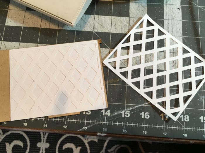
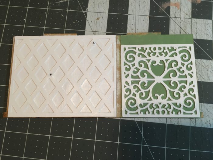
Measure your ceiling area and adjust the design if needed. Cut two of the lattice design and glue them together. Glue to the cardstock base. Paint and seal then attach to the MDF base.
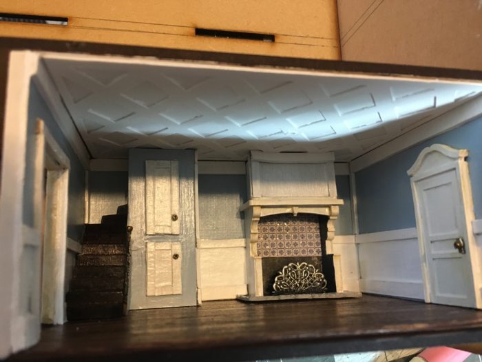
TIP: In the room below I’ve used medium-weight chipboard for the walls and trim. You saw this in my first post of the build. If you compare this room to the dining room where I’ve used the thick cardstock …. this room looks a bit on the chunky side I think. Knowing what I know now… I would choose to use the thick cardstock for the walls and trim over the thicker chipboard. Even the thinner chipboard made for Silhouette or Cricut machines would work better on this scale than the thicker chipboard I think. Just something to consider.
Dining Room
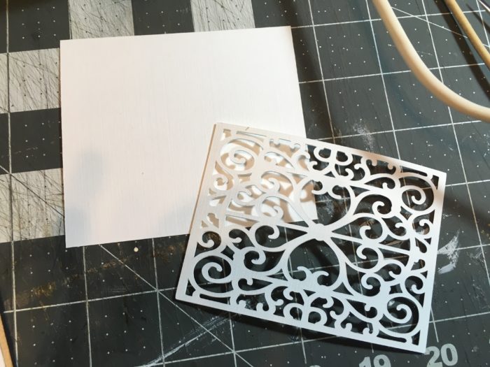
Measure your ceiling area and adjust the design as needed. Cut two of the scroll design and glue them together. Paint and seal the scroll design element.
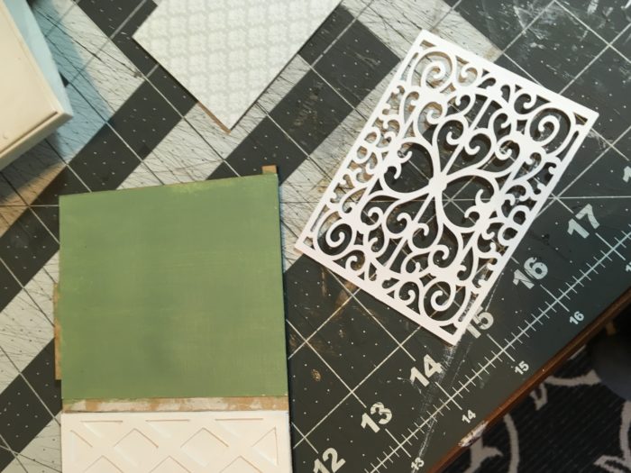
Attach the cardstock ceiling base to the MDF base and paint as desired. Attach the scroll design to the base and seal.
If you will have lights in your structure, you will want to drill holes for the light and wires at this time.
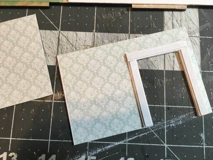
Below I’ve created the left and right walls for the Dinning room. The door frame was created with heavy Kraft cardstock, painted, and sealed.
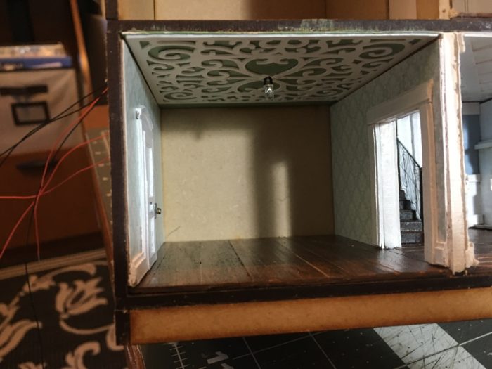
Here you can see the room with walls and ceiling attached. I’m waiting on a custom china cabinet built in for the back wall so you will see that in a later post.
Flooring created with 1/16 thick Basswood, stained and sealed.
Library
Once I discovered how nice the ceilings turned out in the other rooms, making walls, in the same way, was a snap! Again, I created two sections for the design element. Notice that one has smaller cutouts than the other. The smaller one will be placed on the base first with the larger hole one on top. Just as the ceilings were done, paint and seal, after each has been attached.
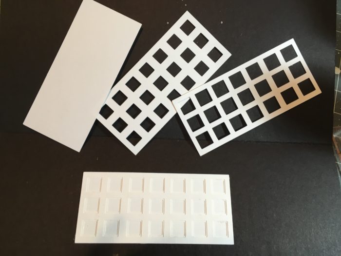
Here’s a look at all of the walls and the ceiling for the library completed. The first image is a test fit.
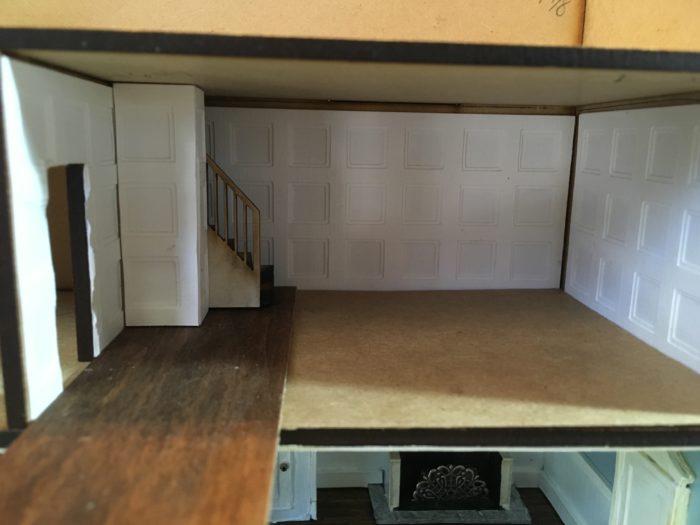
Flooring was attached then walls were attached after they were painted and sealed.
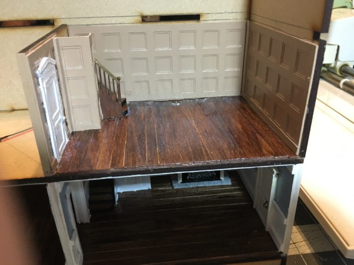
Ceiling attached.
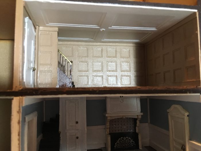
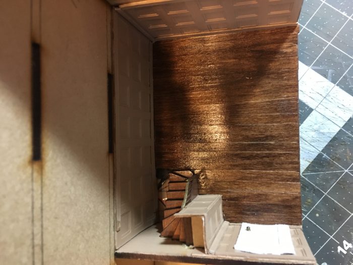
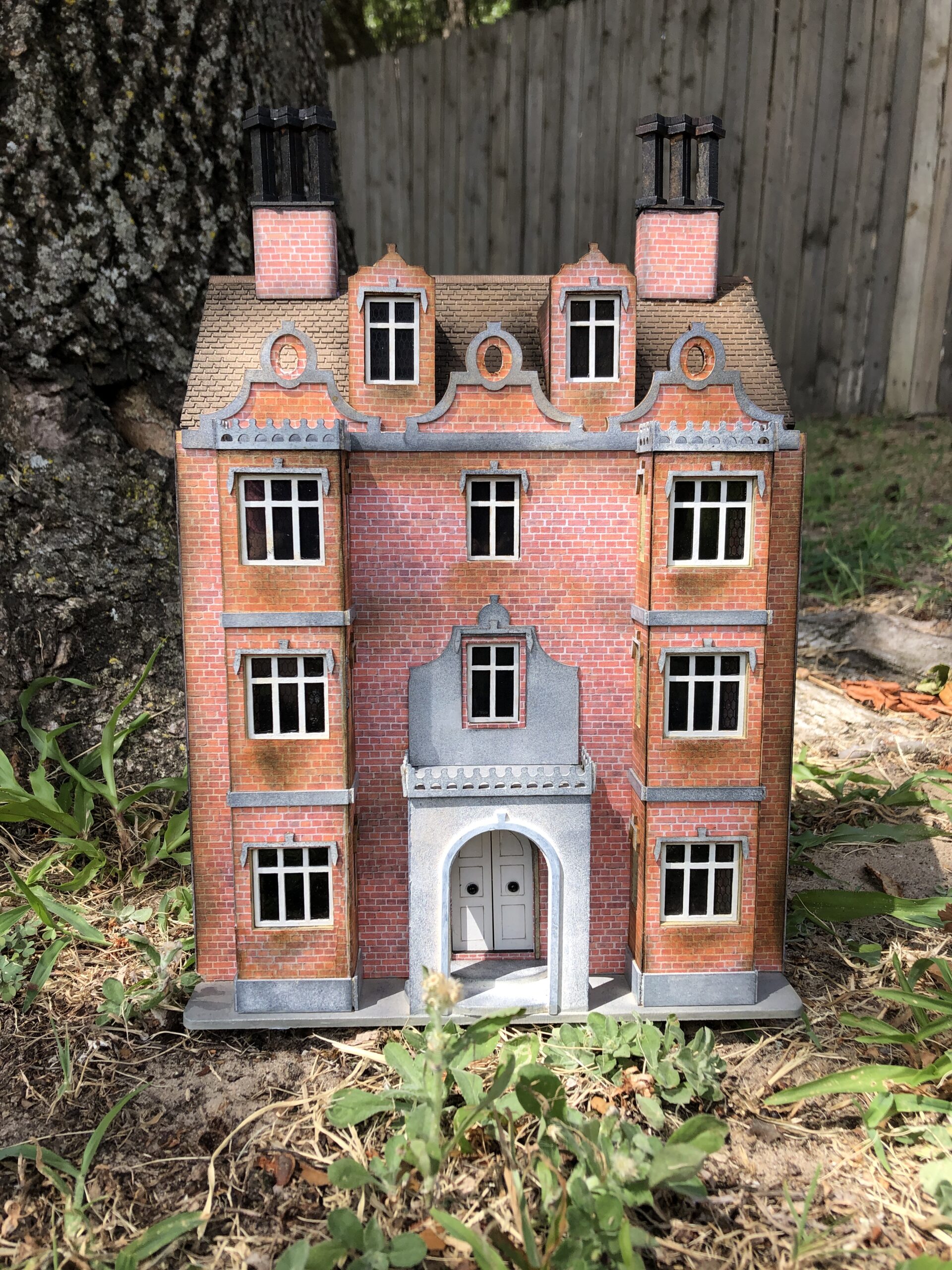
One thing that surprised me when I opened the Havisham kit was that beyond what went on the front panel, there were no doors, stairs, or windows included. I talked about the stairs in my first post but I want to note that in the image above you can see how I’ve altered the stairs to fit the room.
The stairs in the room below would normally come up in the corner of this room so I pushed these stairs forward into the room to give the illusion of a stairway opening behind them. Wrapping the stair walls with the room’s wall panels, at the room height, gives the illusion that the stairs continue on up to the next floor.
Just keep in mind that if you want to put stairs in Havisham, you will likely have to make adjustments to them.
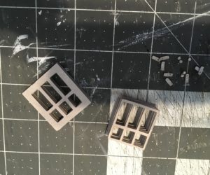
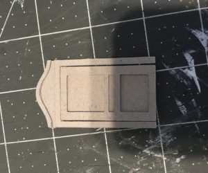
Last but not least… I wanted doors in the inner rooms and using the dimensions from an existing door I had on hand, I created my own. The same for the windows. I’ll be using some false windows on the outside of the house as well as in the addition I plan to add.
With the doors, I used multi layers of the pieces to get the thickness I wanted.
So that’s where I am to date on Havisham! Next time I’ll be building and adding the custom cabinet and working on the second-floor bathroom. Stay tuned and check back soon!
You can keep up with my new postings by signing up for my weekly newsletter!


Leave a Reply
You must be logged in to post a comment.